
Neutral spaces get a bad rap. People assume they’re bland, safe, or lacking personality. But when used with intention, neutrals can be some of the most sophisticated, high-impact choices in a home.
The difference comes down to one thing: layering.
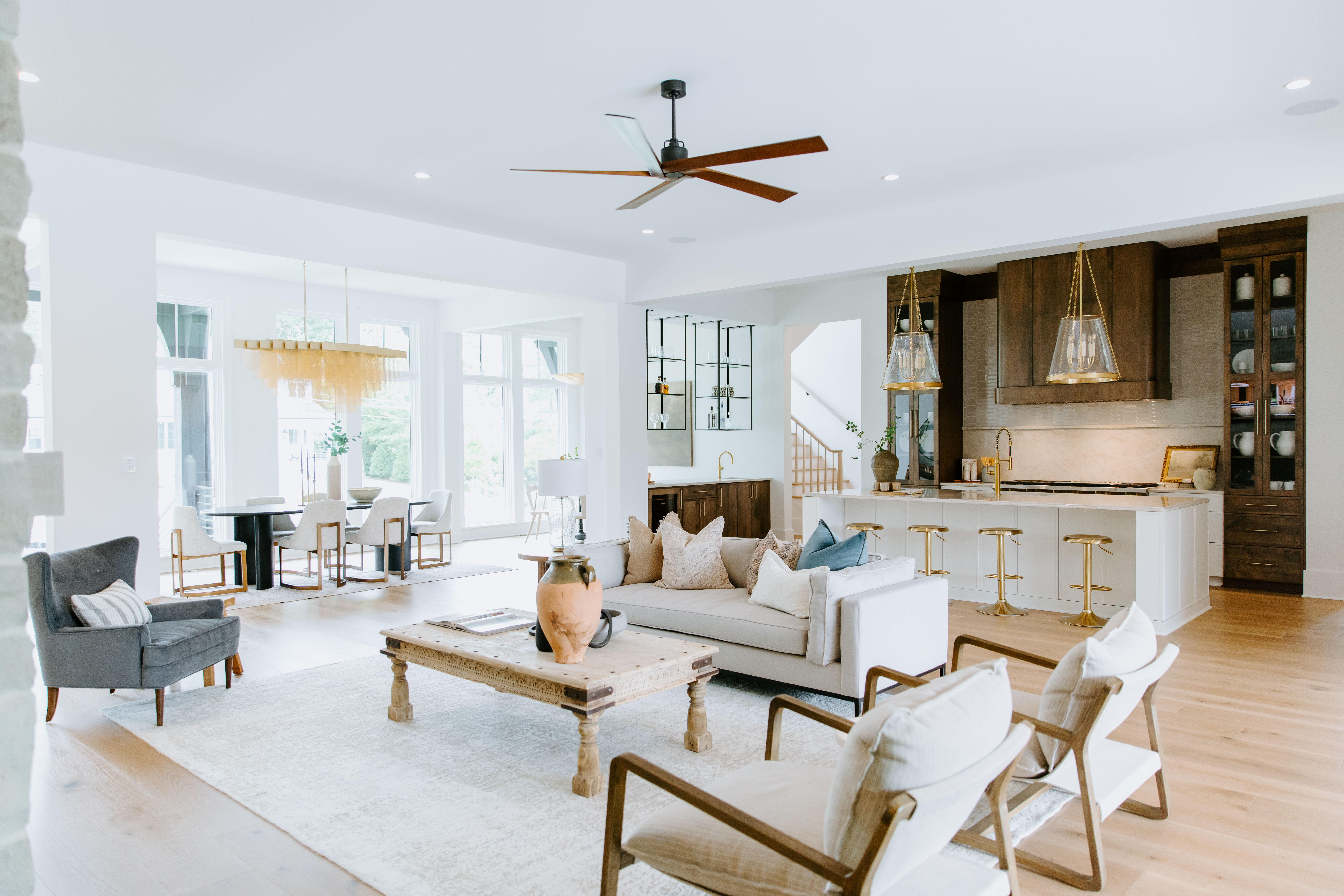
Because it’s not just about color—it’s about tone, texture, and balance.
It starts with tone.
There’s a wide range within the neutral spectrum. Soft taupes, warm creams, rich charcoals, cool grays, natural whites—all of these behave differently depending on the materials and lighting around them.
Pairing warm woods with cooler tones (like flax linen or pale stone) creates contrast without overwhelming the space. This kind of variation is subtle, but it adds instant depth.
Neutrals don’t need to match. They need to relate. When done well, those small shifts in tone create harmony without feeling flat.
Texture does the heavy lifting.
Without texture, a neutral room can feel one-note. But with the right mix? It comes to life.
Think about matte ceramic vases paired with soft wool throws. Woven light fixtures layered against plaster walls. Linen drapes next to raw wood furniture. These combinations work because they create tactile contrast. They give the eye something to land on—without introducing visual noise.
Texture is what keeps a neutral space from falling asleep. It gives it personality, movement, and warmth.
Balance is what ties it all together.
The trick to layering neutrals is knowing when to hold back and when to lean in.
Vary the scale of your decor—mix larger foundational pieces (like a soft-toned sectional) with smaller details (like hand-thrown ceramics or framed linen art). Break up too many soft surfaces with a bit of structure—angular shapes, raw edges, or subtle black accents that ground the space.
The result? A room that feels calm, considered, and effortlessly elevated.
Why neutrals work
Neutrals give space to breathe. They quiet the visual noise so you can focus on scale, shape, and flow.
And while bold color can make a statement, neutrals have a staying power that lets other elements shine—your lighting, your layout, your architectural details.
When layered thoughtfully, neutral design doesn’t just feel beautiful. It feels intentional.
The takeaway?
Neutral doesn’t mean boring. It means balanced.
It means less noise, more depth—and a space that holds up over time.


Leave a Reply